Sunday, August 17, 2008

welcome to the jungle

Sorry this post has taken so long things have been crazy. But lets get into it the goal of this episode was to create an outfit for a character in the TV show the lipstick jungle, it needed to be an outfit that can be worn to kick butt in a conference room and be worn out for a night on the town, and there was mention of a boho edge as well. the character is a well off, high powered, and fashion forward business women played by Brooke Shields. They all pitched their designs to Brooke and she picked 6 she liked and the designers were split up into teams of two, which was like watching kids trying to pick dodge ball teams, team leaders trying not to hurt feelings, but worrying the hell out of the kids who are among the ones picked last. I am getting pretty stoked on the costume design challenges and it's looking like there are more in the near future, they look pretty ridiculous, and hey chris will be back from last season, which i am looking forward to as well.


designers: kenley and keith

Casey:this was the winning dress. it doesn't bug me as much here in the picture than it did when it was on the runway. I am realllly realllly glad they did not use the small floral print for the top, it wasn't a terrible print but would deff have not worked in the final garment. Tim knew this and let them know. Now I am gonna let a little secret slip here. Really there is a sure fire way to get to the top 3 if not win the entire show designers....LISTEN TO TIM GUNN! he knows what he's doing and his tips are gold, have you seen any of the other seasons? on our last shopping excursion Kayleigh and I both expressed an admiration for high waisted skirts. and it can look great if worn correctly and paired well with the correct top. but this is more empire waisted but the shape of the skit looks like it should be for a skirt at the natural waist line (which is the same as the high waisted skirts that are around lately) something about it throws the look off a bit for me. I am a big fan of the pretty brown. I still think that jerell's was a little more lipstick jungle esque


designers: suede and terri
Casey: so terri did her usual flouncy top and pants combo and complained about it the whole way and pretty much blamed suede and looked like she was ready to throw suede under the bus. but the bus stopped and tim liked it, in which case she pulled a total role reversal and was happy go lucky and acted like she never doubted her own genius....hm. it's boho yep, but doesn't scream office apparel to me.


designers: blayne and leanne

Casey: this is way to casual for the office. i think the character might would be more likely to wear it to the beach than to work. i like the color of the blue tank under the blouse. I'm glad blayne took the blow and stood behind his work saying of the two he should go bc it was his design, but there was a bit of a tantrum when they questioned his taste. and i am pretty certain you could find any of these pieces in a local mall, which isn't what the judges want.


designers:daniel and kelli

Casey: this was way too vixeny for the character. not that the character isn't sexy, just not this brand of sexy. i was bummed to see kelli go but i can see why she went i guess. the fabrics and the style came out more trampy than everyone thought they would have, the construction is pretty shabby too. Daniel has this high taste supposedly but the guy can't even spit out a pencil skirt?! you can see my confusion if not...
pencil skirt = classy
pencil skirt = basic and pretty simple construction
therefor the skirt should have been done quickly and efficiently and been classy.
but daniels pencil skirt = crooked, sloppy, ill fitting, and therefore not slick in any way.
his bff on the show LAUGHED at him when this was brought up, ouch. I wish he would stop looking like he is going to cry all of the time. that might help.


designers: joe and korto

casey: this is too much ethnic flair, yeah korto i know that's your thing. it looks like a mix of winter puffer bomber jacket and a sweet potato. but the shocker here....no wide leg pants, instead we have a poor fitting unappealing nude dress.


designers: Jerell and stella

Casey: This one was my favorite, to me it seemed best fit to the character it was designed for. it looks like it could be worn to a meeting and worn out as well. the leopard print fits the lipstick jungle theme but doesn't look too cheap, and the yellow leather piece really adds a lot to complete the composition with great contrasting color and texture. way to apply the leather working to fit into the design, stella was content. maybe a jacket for the office would have sold it more to the judges.

Thursday, August 7, 2008

Tanorexia?!

Okay guys, so we're into the 4th week of the season. Can anyone really tell me what's going on?! There are absolutely NO standout designers. I talked to Casey about this earlier, I feel like it's easier to pick the designer you don't like rather than one that you do, and after the 2004 election this was a feeling I didn't want to revisit.

The designers aren't wowing anyone; or, if they are, it isn't a good wow. We have witnessed some of the absolute worst designs this season! What is wrong with you designers?! Why can't I have a favorite one of you without having you disappoint me, yourself, and then getting kicked off the show the following episode?

I also think it's a bit ridiculous that the judges are just letting some designers slip by every single week. Namely, Keith, Daniel, and up until this week, Jennifer. Keith has, in my opinion, put out some of the least cohesive designs in terms of what the challenge was. They are by no means strong, but somehow he manages to just slip under the radar. Last weeks dress? Looks like you forgot to make it and just slapped some scraps together. Daniel? You are never ready for the runway show! And you always use some sort of shiny that inevitably looks tacky and unfinished. Stella and Korto, that doesn't take the pressure off of you two though either. It's getting boring watching you re-create yourselves and your styles every single week, in a different color (except you Stella. Way to be consistent).

Now on to Jennifer. I'm sorry girl, I was rooting from you from the beginning because you're from my hometown (even if you refuse to admit it.) You have made the cute doll outfits weeks 1-4, and unfortunately that caught up with you. One would have thought you could recreate the American Girl Doll by this point, but you missed the red, white and blue memo. I liked her clothes, with a few exceptions, but cute styles. Unfortunately the show doesn't focus on one design aesthetic, and the winner ultimately needs to be versatile. Which, is kind of bad luck for a whole lot of you guys. Oh, and you're... a surrealist? You said they couldn't handle your surrealism when you were kicked off. I think I'm just going to let that thought go here. Because I'm surreally confused by that.

Right now, I'm just enjoying Blayne complain about tanning (and come on, he is a little funny), Stella talk about leather, Suede talk about Suede, but that's really about it. Terri and Leanne and Kelli, you are my girls as of right now. I may even put some hope into Jerrell, but let's not speak too soon.

There's always next week to change your mind.

we are looking for uniforms that represent 'merica and we get "if your sport is drinking it's a good dress"

So for this episode the challenge was to design a uniform for the US Olympic team to wear in the opening ceremonies ( the uniforms are also the same for the closing ceremonies, and are what the teams wear around the village). No the winning garment for this challenge is not the uniform they actually wear at the ceremonies this year. The actual uniforms this year are below, and if you couldn't tell simply by the sweater vests, they were designed by Polo Ralph Lauren . Apparently the Olympics take place on a yacht this year.
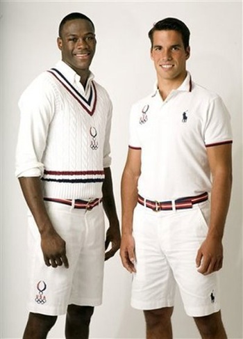


Casey's Notes on this ep: This episode really was pretty boring to me. I would rather design or watch people design dresses, gowns, and the like. Uniforms aren't fun to watch. As usual Stella made me laugh with her rock and roll quote, "plenty of bikers watch the Olympics" that was her defence haha. Blayne may have fried skin and brain cells in the tanning booth but it is funny to watch him go through withdrawal, he acts like he is going to shrivel up and die, with out nuking himself soon. Tim Gunn's reaction was the same as my own when he did not get the Sgt. Pepper reference, that one hurt my soul.ugh. I am listening to the Beatles as i type this.


designer Leanne

Casey: to start off my own vision on what the uniform should be in between two places but not to much of either side, we want some gym teacher in there, the Olympics kids, athletics is key, but we are representing out country so we have to look slick, but not pompously so. this is one of my favorites out of the group. its got the athleticism with the shorts, but a crisp fabric to keep it sleek.I'm not a huge exaggerated collar fan personally but it still says USA with a little class and athleticism in there.

Kayleigh: I am with Casey on this one, I like this outfit. And to take this further, I actually like the exaggerated collar. Especially seeing how many designers chose horrible options for neckwear in this episode, I thought hers was appropriate and patriotic. Leanne is pulling ahead for me again.


designer: Stella
i really dislike the GO GO dancer bellybutton keyhole thing in the top. the black didn't look as terrible as i thought it would. but this says more futuristic biker than opening ceremonies. but it does show an athletic side and not just straight biker. she is trying. shes complaining the entire way, but shes trying.

Kayleigh: Hm. It looks like there's some sort of space challenge at this year's Olympics.
Stella is increasingly more and more frustrating to me, primarily because although this week she has managed to alter her design aesthetic, she is still doing very much of the same thing week after week. Bo-ring.


designer: Terri
This one was my favorite. as usual i would have toned it down a bit. the scarf is a little to frou frou for me. i love the pants, crisp sharp, the pin stripe piping at the sides adds some athletic flair. i like the jacket, it's tailored really well, and looks great with out being too country club. i liked the mix of patterns through the whole outfit. I'm not sure a tube top would be the best top, i would have stuck with a basic shell. but way to rock the separates Terri, and she cranked out all the pieces in no time.

Kayleigh: I'm a fan of this one too. I feel like there's a lot going on with all the different patterns and textures, and how low does that top go?! seriously... But yeah, go Terri. Two weeks in a row. Yay, you!


designer: Suede.
Casey: i think this is cute. too cutesy i think for the uniform, but still cute. the skirt i think is a little to cheerleadery in the cut but the top is great. clean cut sharp, with an athletic edge to it. not bad compared to some of the rest. it looks a lot like the skirt that got the boot, but the fabric and colors say USA and that's what saves it. i blazer would have helped, but not everyone is up to the skill level of cranking out lots of pieces. to each their own.

Kayleigh: I feel like Suede out-Sueded himself a little with this one. It's veryyy cheerleader-ey, and I think the fabric choice of the skirt made it a little too much for the challenge. I agree, another piece would have been nice.


designer: Keith
Casey: i like the effect the striped fabric had when it was gathered like this. i don't like bubble skirts but this one has appeal. does it look like an opening ceremony uniform to me, not so much. but the colors work.

Kayleigh: I like the skirt, a lot actually. But... the challenge? What was it again? He got the yacht memo, though.


designer: Kelli
Casey: colors work. but this is too vintage. the designs were supposed to me modern day, for this years ceremonies. the polka dots are more holly home maker than, pro athlete.

Kayleigh: So cute... so not the challenge. I honestly feel like with the exception of Joe the challenge could have just been "We're going to be making a calendar spanning the 1900's, everyone here has the month of July, go make it work!"


designer: korto
Casey: this one was one fit the bill better than others i agree. it won. the pants are formal enough and the fabric is great. there is the athletic bits with the vest. i wish there were a sleeve though. and i wish she would make something besides a simple wide leg pant, this looks like her last look in a white pretty much.

Kayleigh: Are any of the judges really looking at designers portfolios as the challenges go on? It's getting a little predictable here. Stella? Tight and leather and studdy. Blayne? Asymmetrical and slightly off-kilter. Daniel? Always a little on the tacky side with a touch of "not quite ever finished "looking." Korto? Wide silhouette. I don't like this, though I haven't liked any of her outfits. So much of the same, and I do NOT think this one should have one.


designer: kenley
hm. no red. and this is a great look for a secretary. but there is no athletic anything to this. eh.


Kayleigh: Good think you had immunity, huh Kenley?

...but I'd wear it.


designer: blayne
Casey: AHG! so much asymmetry this season. ick. it is athletic in certain aspects and the colors are patriotic. this is really 80's to me. is Blayne the boy George of project runway? maybe.

Kayleigh: What was that tv show on nickelodeon where they had a bunch of kids up in space? Anybody? and there was that girl with the rainbow hair? I think he took this from her closet.


this may not be the show you were thinking of, but Zenon Girl of the 21st century...tv movie for disney from 99 (wow was it really that long ago!) looks like it could be some of blayne's handy work... haha


designer: daniel
casey: i knew the fabric and color wouldn't be the royal blue he wanted on the runway and he should have known as well. know the lighting your pieces are going to be under guys! the right or wrong gel and angle can and will completely change the color of a garment!!! and since i really doubt you have any correspondence with the lighting design team here, you have to got to work around it. color and lighting aside, that alone could not have helped. this is a cocktail dress from the 60's . does not scream Olympian...i don't think it even whispers it.

Kayleigh: NOT BLUE. NOT OLYMPIC. NOT...PRETTY.


designer: jerell
casey: please refer to my vintage rant from earlier. inspiration people take from it, the woman is ready to play shuffleboard on the Titanic, she is not thinking gold medal at the games. at least he listened to Tim and fixed the stripes on the skirt to make them vertical, so the model doesn't look like heavier shuffleboard player.

Kayleigh: Not appropriate for the challenge, but I'd love to play shuffleboard on not the Titanic. In this. But yeah, it's a bit on the 'too much' side.


designer: jennifer
casey: ???????? she got lost on the way to a tea party and some how ended up in a challenge meant for modern Olympic athletes. there is no USA any where here.

Kayleigh: SYRACUSE... come on.


designer: joe
casey: it says 'merica for sure. it is athletic sure. and it will look good on athletic bodies. but the length on the front of the skirt is terrible and throws the whole composition of the outfit off.

Kayleigh: I really liked this one. Not so much on a personal level, but the dude knew what he was doing (well, with the exception of perhaps the proper way to execute the "skort"). Totally should have won over Korto.

Friday, August 1, 2008

Ode to Emily


Here is a link to Emily Brandle's clothing line Smoke and Mirrors. It's got a lot of cute little things that you didn't see in her collection during Project Runway like big buttons, loose-fitting dresses, flirty silhouettes. Check it out. We will miss you!!

Thursday, July 31, 2008

episode 3

So before i get into it here are some quick observations/rants i have about this episode. Stella, shut it. Blayne is a creepster, do not try and force your catch phrases on Tim Gunn, "holla atch boi" ugh. someone is going to slap that tan off of him sooner or later, you can tell that he is getting on peoples nerves. Keith don't call Tim Gunn buddy. you have known the man for 2 days, and it's Tim Gunn . Did Luke Skywalker just start off calling yoda buddy? No. Would Gretzky do the same to Howe? Nope. You get my point. Tim also looked like he was little under the weather with a cold in this ep, wanted to make him chicken noodle soup. Last but not least, Suede, you need to work on the hair to gel ratio, and would it kill you to learn a pronoun or two?!

Onto the clothes! the designer got to go on a bus tour of the city and were dropped off at different places around the city armed with ponchos and digital cameras to find inspiration for the next project. unfortunately i could not find pictures of the pics each designer used for inspiration, i will keep an eye open and post them later if i find them.


Designer: Stella
Casey: I have a feeling this is exactly what all of her stuff is going to look like. it is deff her design point of view "hookah punk rock" and hey who knew she would opt to use leather. didn't see that coming did you? I like the snaps at the bottom of the jeans. not bad, but it will be if this is all she can produce, even though a lot of designers do tend to put out things that look alike this is more likely to get old quick.

Kayleigh: Wow. Didn't see this one coming. Okay though, so she's good at making tight fitting 'leatha' clothes. And vests. And lace-up everythings. And metal studs. And zippers. But why haven't the judges caught on yet? I don't for the life of me understand how she seems to slip under the radar when she's popping out the same outfit every week. One day I'm sure it'll catch up with her, but until then I look forward to the next annoying 'I'm rock n roll' moment from the queen of leather. But yeah, back to the outfit. I feel like Stella really lucked out with her model, she seems to pull off the look rather well; overall it works but I'm not impressed.


Designer:Leanne
I really reallllly liked this one. the picture doesn't do justice to the pretty detail and pleating in the skirt. it's clean , pretty, and still fresh looking. Has any one ever seen the movie the witches... witches planning to get rid of kids my making chocolate bars that turn them into mice...maybe? No? IMDB it. any who the shoes remind me of the movie bc one of the clues a creepy old lady is a witch is she will have squared feet or something like that. to the point, I'm not feeling the shoes, and will never take candy from strangers bc of that movie. even though the kid turned mouse totally pimped out his room with those crazy plastic tubes you could put onto hamster cages. this has gone on far to long and i am way off the point now. i like the skirt.

Kayleigh: I loved this one, and personally thought it should have been the winner. The overall look was great; you really can hardly tell it's a two piece outfit. I was a little afraid at first when I saw her working the semi-circles again... after last week it basically spelled trouble, but she's pulling ahead for me again as a designer.


Designer: Terri
Casey: the judges all liked this one so much more than i did, i just think it's too much fabric it kinda takes over, the sleeves are too long, i think it could have lost some length at the bottom and the sleeves needed to be downsized. the back is really nice, with the backless cut.

Kayleigh: I'm with Casey on this one... it didn't do as much for me as it did for the judges. It is an interesting concept for an outfit, and I feel like this one made Terri stand out a bit more, as she was blending into the scenery on the show until now. But, the pattern? Really? I feel like something so busy kind of detracted from the outfit because the top was so massive between the high neckline, long sleeves, and general length. But yeah, good for her.


Designer: Suede
Casey: I am fond of shirt dresses. but i tend to be more of a basic shape and tend to shy away from to much flair in clothes. i like the dress, I'd un-pop the collar and maybe tone down the bedazzler a bit, there is a lot of shine with the glitz, belt and shiny bits maybe a black belt instead of the gold one would have done it for me. but not bad suede, not bad.

Kayleigh: I didn't mind this, but Suede is so far a very hard designer to read. This is incredibly simple minus the bedazzler effect and gold accessories, but then when you look in relation to all the other outfits (um... Jerrell made a gown!?!) it seems pretty inadequate in terms of how much time it really looks like he put into it.


Designer: Joe
Casey: once again another i would like more minus some cheesy flair. i really like look of that gold kinda iridescent corset top .i think the thick black lines kill it a bit. i would have stopped the lines under the bust and i would ditch the dog collar. i like the kind of bustled skirt too.

Kayleigh: I thought this one really corresponded well to the photograph he took. The lines on the top were almost identical the lamppost he modeled it afterwards, so for me the design, although not my favorite, translated well for the challenge. The bling, however, I could do without. I am personally driven away by any garment that comes with jewelry or accessories already on it (with the exception of a belt here or there).


Designer: keith
Casey: i don't like this. too much white. would not do nice things to any one's shape, raggedy looking. meh.

Kayleigh: We focused a lot on Keith this episode, and his vision for this dress... It looks very reminiscent of a patchwork quilt in the planning stages, and I could have sworn I heard him tell Tim Gunn that he would fix the silhouette (which he DIDN'T!) I think this could have been cute if maybe he used the loose pattern for a corset-top, and then structured it a little bit more with maybe a pencil skirt, or even a poofy bottom. But that texture is too much for an entire dress. Waaaayyyy too much.


Designer: Kenley
Casey: the winning dress? the judges took to this piece much more than i thought they would. i thought nina would eat her alive. yes it is a different shape, and they do like volume in their garments i guess . but i don't think its flattering..the combo of the puffed sleeve and the high neckline is too much i think,, it kinda takes over her face and seems clustered i guess is the word I'm looking for. i like the ombred tulle that was a fun fabric and she worked it well to create the shape, but i don't think its flatters and the print is really loud. maybe if the dress was done in a less crazy print or in the same print but a simplified line and shape at the shoulders of neckline would have worked better. all of it together is too much excitement.

Kayleigh: Well, I didn't see this one coming as the winner. It's cute, I guess, but didn't they tease her about the silhouette at the beginning? The pattern doesn't do it for me at all, and I think she's damn lucky she had a girl who could pull off those colors. I don't get it, so many designers this season are going with patterns that remind me of seat covers in my aunt's summer home circa 1982.


Designer: Kelli
Casey: Hm. not my cup of tea, but it doesn't irk me like some of the others. the top is interesting, can't quite figure out if it was how she put it together or if its the fabric creates the top layer of the bodice, which intrigues me bc i can't pin point the craft behind it. the bottom layers of the bodice are actually really pretty the straps and bodice are a sheer kind of tulle maybe or softer fabric i really liked the look of it, but you cant see it under that stripey top layer, so once again i would have liked to see it simplified to see the more delicate pretty bits under all the crazy 'high fashion' (?) flair.

Kayleigh: Not too into it, but I do give her props. I think next to Jerrell, she's the only designer who displayed just HOW MUCH one can get done in the time they're allotted when the


Designer: Korto
casey: korto likes wide sleeves and pants in her designs. maybe it's the pic that doesn't show the detail, or maybe there just isn't any in the outfit. this was too simple, basic black and boring. not appalling but nothing to remember.

Kayleigh: Boring. Korto needs to go home.


Designer: Blayne
Casey: so if it weren't for last week's dress i would think that his design stance was just straight cooky and ugly. cookgly? uglooky? how he was not in the bottom 3 boggles my mind, it is basically the same dumb design as the one that got the boot. he likes to make a simple basic shape then ball up bits of things and just stitch it on top of it where ever it lands. what the heck? honestly there is no thought where things are placed, it does nothing for her body, its not pretty it''s not artsy, how is he still here?!

Kayleigh: So, Blayne stayed, but Emily left. Seriously? This is almost the same dress as hers, though I think Emily had more structure to it. Sigh.


Designer: Daniel
Casey: i kinda like this one. i think the waist could have been tailored a bit more to cinch in the waist, it would have made the details of the top vs the bottom pop , and would have really brought the composition of the dress together. if he could just fix those random bits that seem to be a bit off in each of his pieces ( waist here, last weeks hem..) he would totally up his a game, and could be a serious competitor, but it seems so far he is always a bit off or just a step behind a complete clean look.

Kayleigh: So, I have two things to say. 1) Daniel is always the sweaty, worried one. Always. He kind of looks like that guy at a store who's weaseling you out of money and he knows it. No poker-face. I don't trust him yet. and 2) draw a line down this picture at the middle, going up and down. Two different outfits much?


Designer: Jennifer
Casey: Dowdy. drab. matronly.

Kayleigh: Should. Have. Gone. Home.


Designer: Emily
Casey: So this was the losing outfit. Was it cliche? yeah. was it simple unappealing and circus meets senorita? yep. Asymmetric again...yeah. But I really think that if compared to Blayne's similar disaster it was the less of two evils. the ruffle thing was poorly place, unattractive and did nothing for the models shape. But Blayne's did the exact same thing only X2. I'm sad to see her go and was looking forward to seeing more out of her.

Kayleigh: I'm really bummed to see her go. I'm not a huge fan of the dress, but if you looked at what she'd done throughout the competition she was by far above the 'average' line. I do think she could have done cooler things with her photograph, but regardless I'll be keeping an eye out for her.


Designer: Jerrell
Casey: and way out from left field comes Jerrell. when this came down the runway i was like whoa, wait a min where did this come from. while everyone else were making tube tops with poorly placed ruffles , this guy made a gown! how he fell between the cracks of the editing room floor this episode confuses me. i love it when the designers make gowns! the length of the front it think could have used one more line of ruffle. but i laugh at the poorly scattered ruffles from the others scrambled over when this came out, how did he get all this done is the same amount of time. it was unexpected so i liked it.

Kayleigh: And Jerrell pulls forward into my list of 'yay' designers this season! Why didn't any cameraman pay attention to him this episode?! He's the man. And I think he deserved a little more attention for this one. Great job and application of the photograph, and great craftsmanship on this gown.

And now for my notes: I was watching this episode with my boyfriend, and every time I watch the show he asks who my favorite is. The thing with this season is, I take a liking to a designer, then they create an absolutely horrid outfit. So, I get myself a new set of pom-poms, and then the new designer I fancy lets me down the following episode. I cannot win yet. Even last season, I was rooting for Jillian from like week 2. So, overall thoughts? Stella and Suede are ANNOYING, and I have no stand-out stars. Leanne, Kelli, Jerrell. Those are this week's. Oh, and a kudos to Terri. You go crazy-patterned girl.

-Kayleigh

Like a fine wine


Happy belated birthday to Tim 'the silver fox' Gunn!!

Tuesday, July 29, 2008

Well hmm...

Hey guys, sorry it's taken me so long to post. I have been in Germany for the past week or so, and just got the opportunity to watch the second episode.

My thoughts are still very much the same that this season is going to be very different from past seasons. I feel like so many of these designers, if not all of them, are little lost sheep around what is expected of them, and their outcomes. This is project runway, you've had 4 seasons to figure out your expectations! And jeez, Stella, stop complaining EVERY EPISODE. And Suede, dude... you gotta stop talking in the third person. It's driving me insane.

So, the green episode. The models had to pick out the fabric, so everything was by far a hot mess (which, by the way, did you hear Tim Gunn use that term?? He must be hanging out with Christian, which makes me smile). I think this challenge would have been drastically different and more successful if the designers picked out the fabric (no one would have picked that horrid brown blahh), but c'est la vie. So basically, everyone's dress was way too short (thanks models), and it was once again down to the wire.

I feel like every runway show there are one or two "what the...?" outfits that don the runway. Last week it was Blayne and Korto, and this week it was Jerell and Korto (umm... get the hint). And then on top of that, there are only 2 or 3 good outfits! These designers need to STEP IT UP.

Pumped on Natalie Portman though, she's awesome and adorable. And here's the link to her upcoming shoe line, I think it launches January 15.

I, once again, will be out of town for this week's episode, but will update as soon as I watch.